EduOpos
Helping teachers in Spain study for oposiciones and walk into class prepared.
A mobile learning app for teachers in Spain preparing for oposiciones: temario, practice cases, flashcards and an AI worksheet generator. Redesign of onboarding and worksheets, plus two new modules: Temario and Supuestos prácticos.
Context
A learning app to redesign, and two content-heavy modules to build from scratch.
From syllabus anxiety to everyday confidence: a connected experience spanning worksheets, practice cases, memorization tools and long-range planning.
Challenge
Dense content. Nested cases. One small screen.
Each topic holds dozens to hundreds of fragments; practice cases nest phases, sections and references. The challenge was making that content scannable, navigable and personal on mobile.
└ Tema · topic
└ Section / Subgroup · keeps original order
└ Fragment · dozens to hundreds
Índice · replaces tabs
Resultado · core content
└ Fase Inicial · Procesual · Final
└ Sections → References
Estudio · practice
Users & problems
Two audiences, one dense learning system.
Lots of content. No structure for a phone yet.
Before designing screens, I mapped how temario, topics, sections and fragments relate, and how practice cases nest phases and sections.
Product deep dive
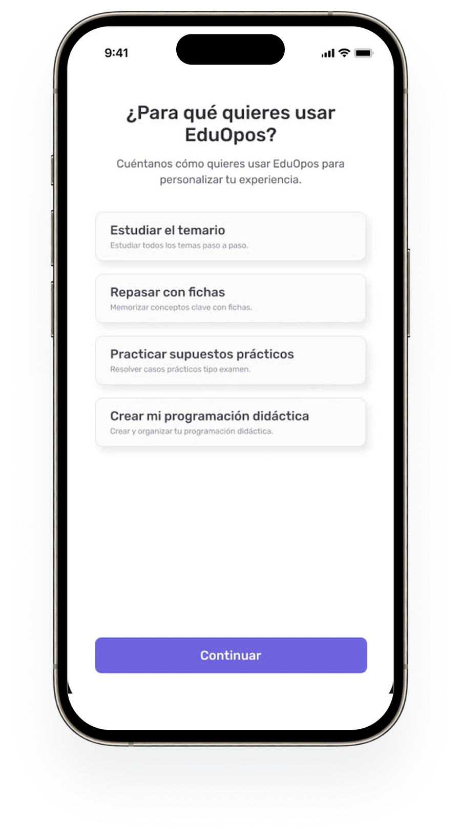
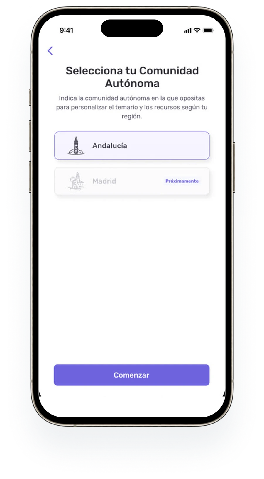
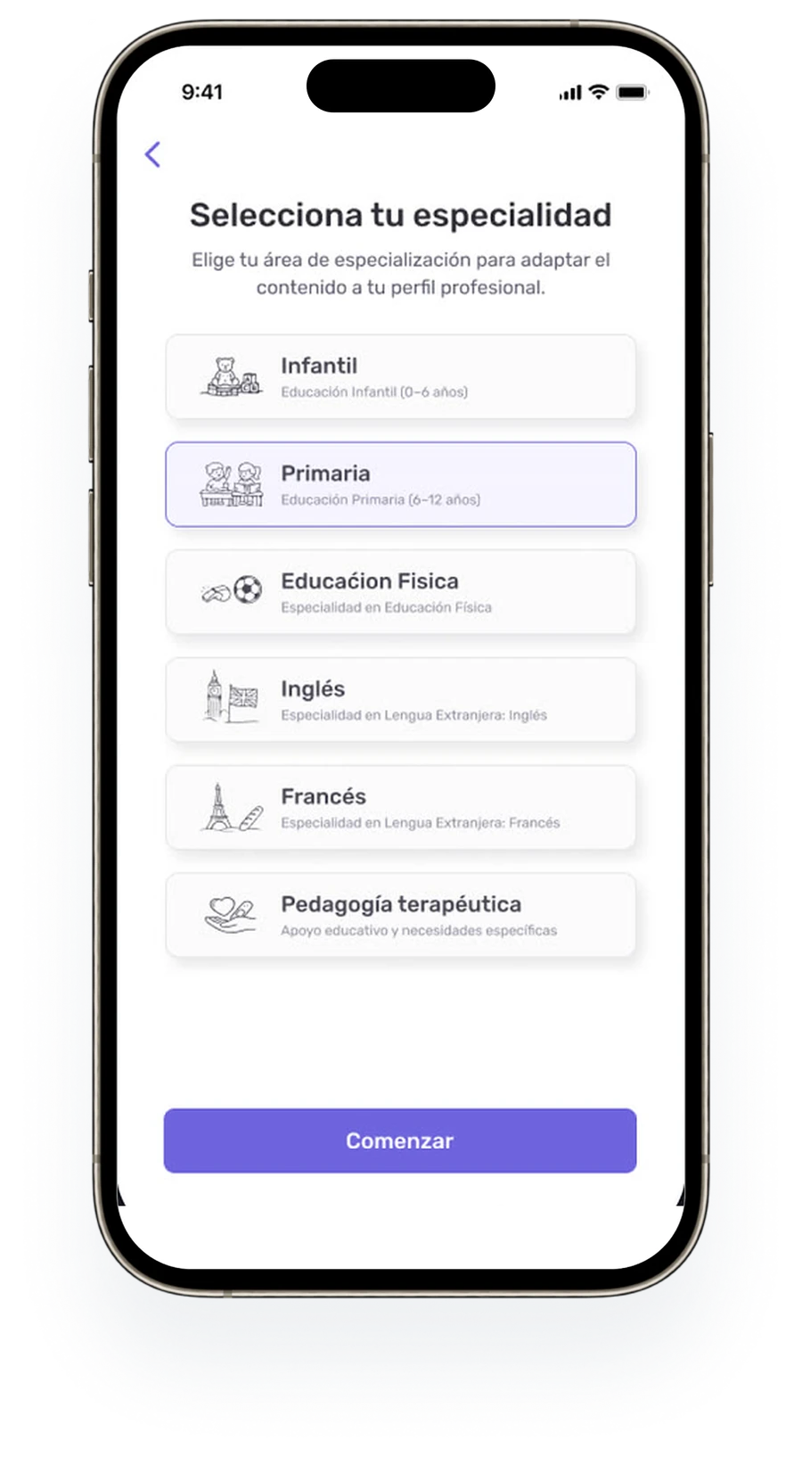
Onboarding & personalisation Redesign
María and Carlos move through the same onboarding, but the system adapts intent, region and specialty into personalized materials.
The problem. Each autonomous community and specialty has its own temario. Onboarding had to capture both clearly before the user sees any content.
Product deep dive
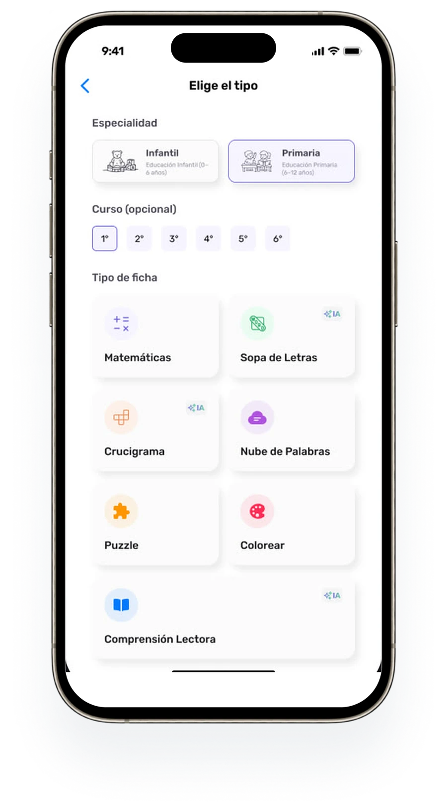
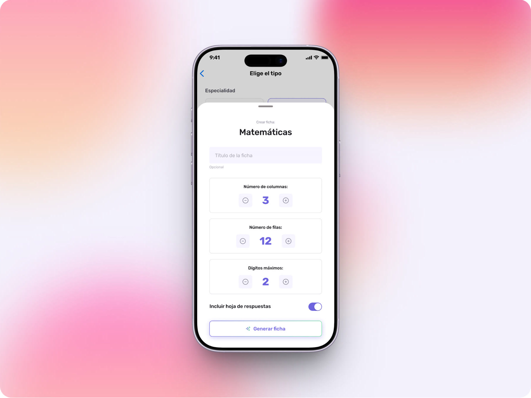
Fichas / worksheet generator Redesign
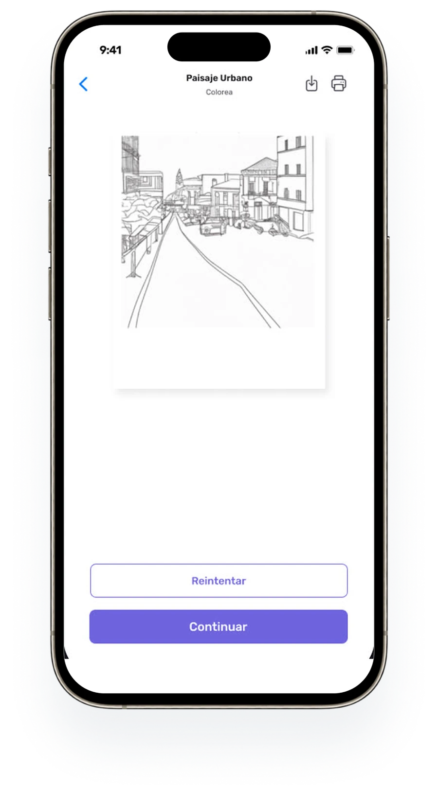
An AI worksheet generator for teachers. I audited the existing flow and redesigned it step by step.
The problem. Teachers need ready materials fast: Matemáticas, Lectura, Crucigrama, Sopa de letras.

Product deep dive
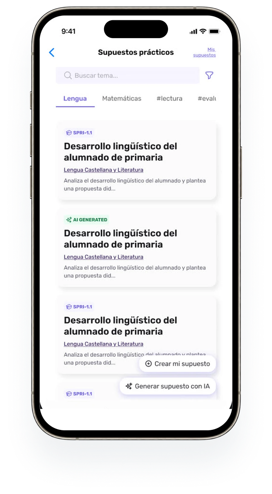
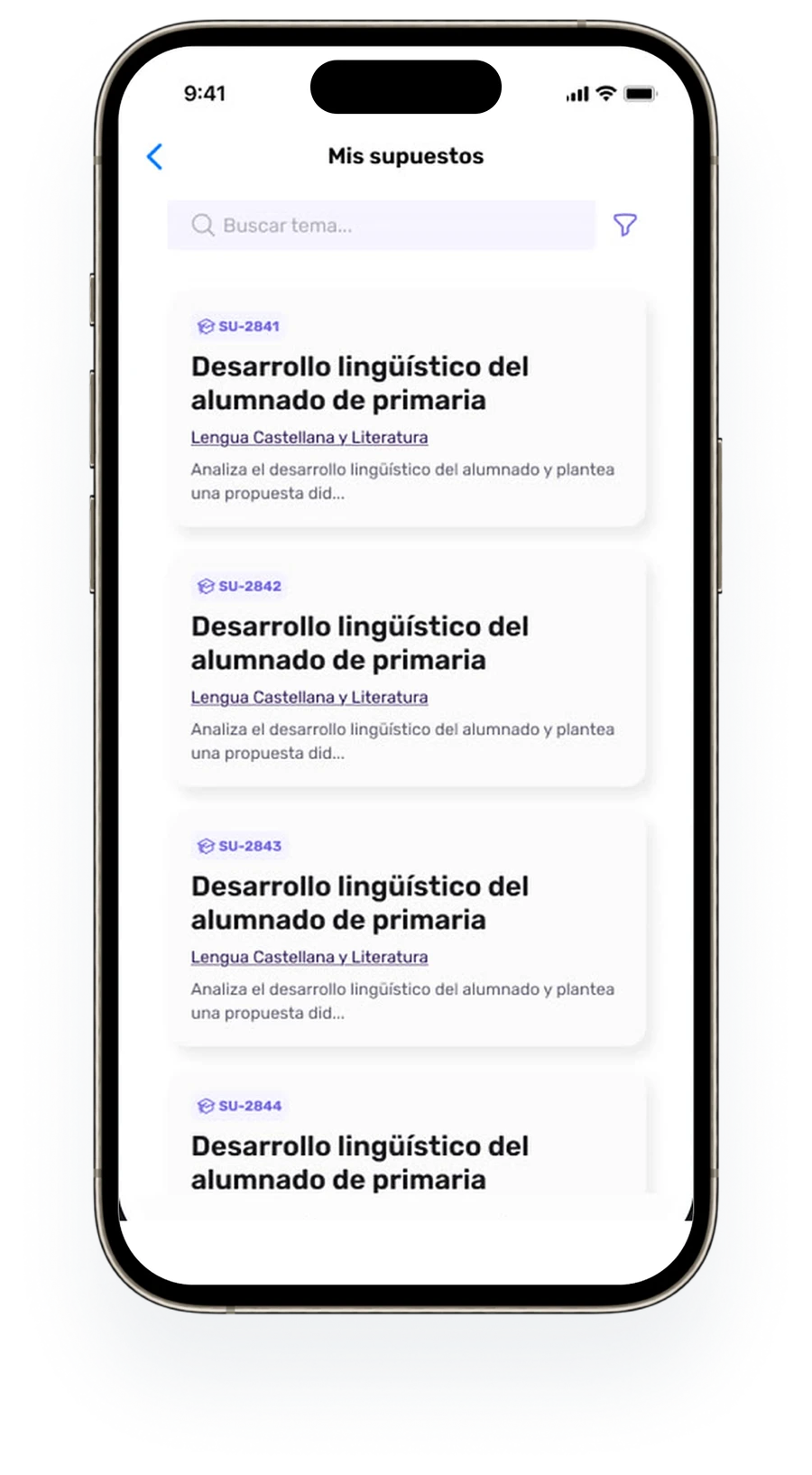
Supuestos prácticos New
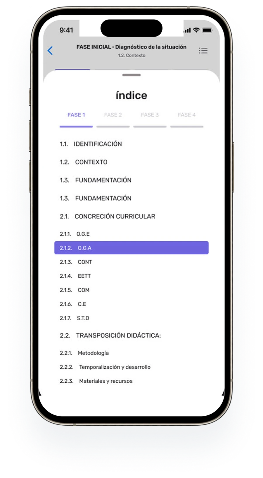
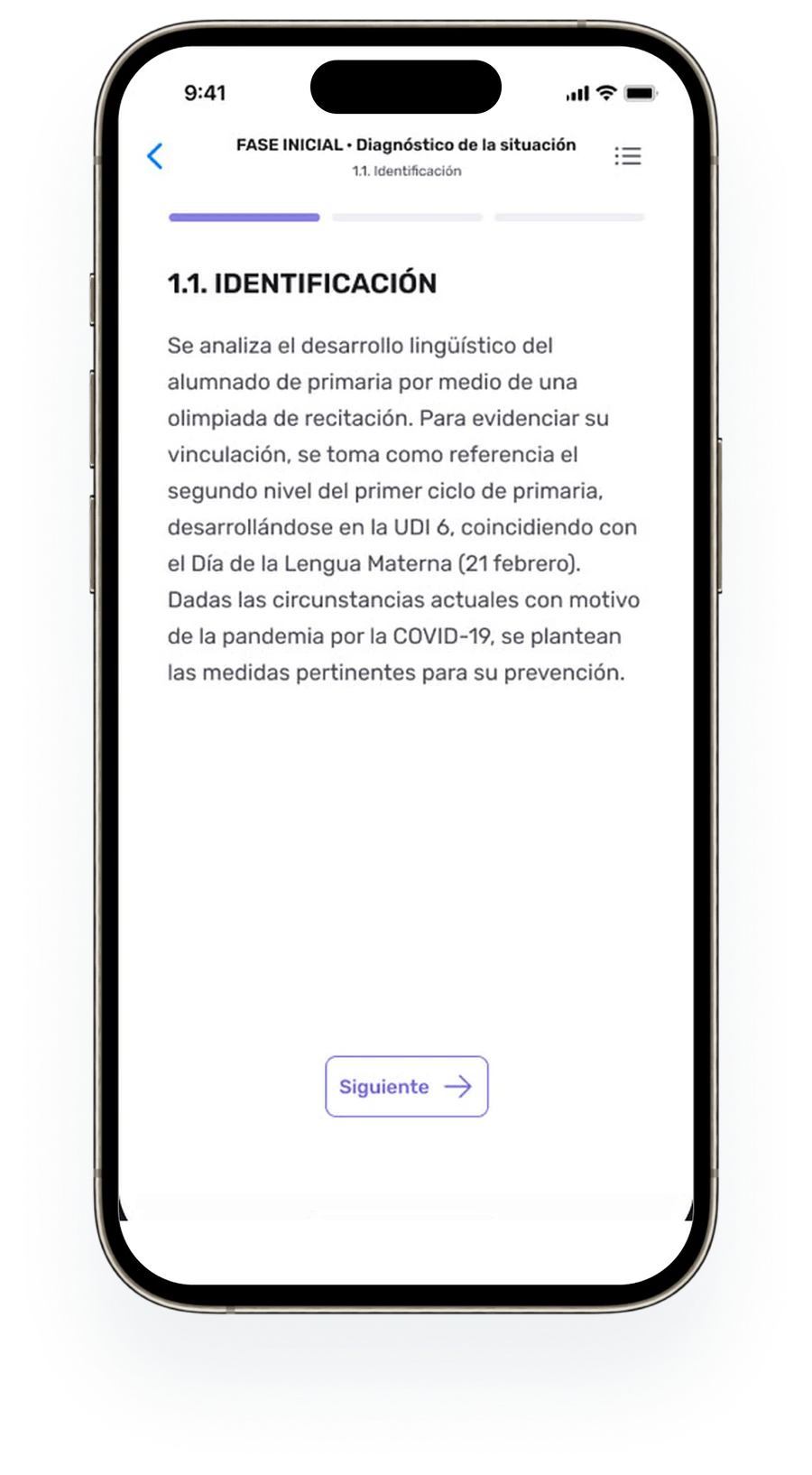
Practice cases with nested phases, sections and references, restructured to be read and studied on a phone.
The problem. A case goes Explicación → Índice → Resultado → Estudio, with Fase Inicial / Procesual / Final nested inside. Tab navigation couldn’t hold that depth.
Supuestos prácticos · AI evaluation
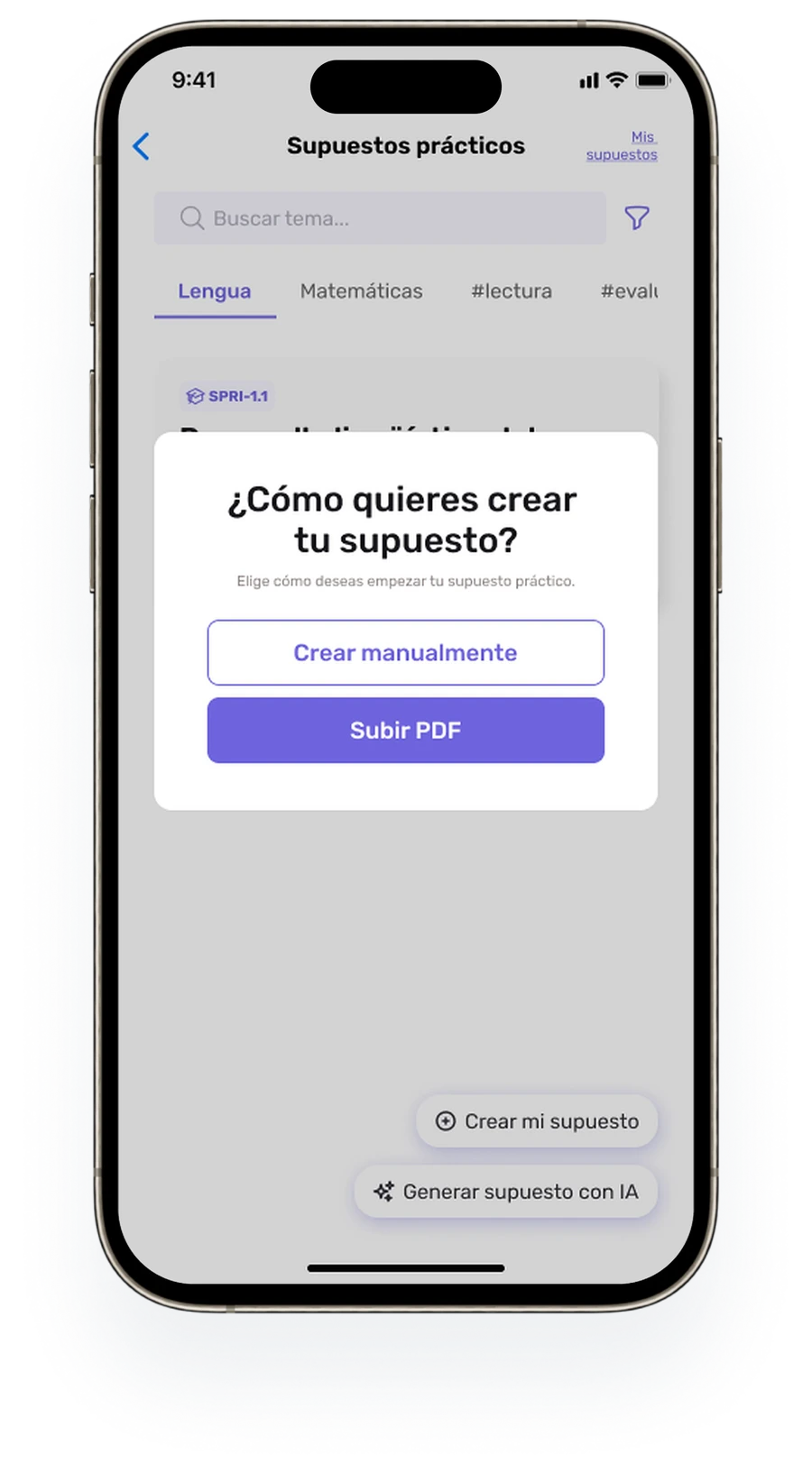
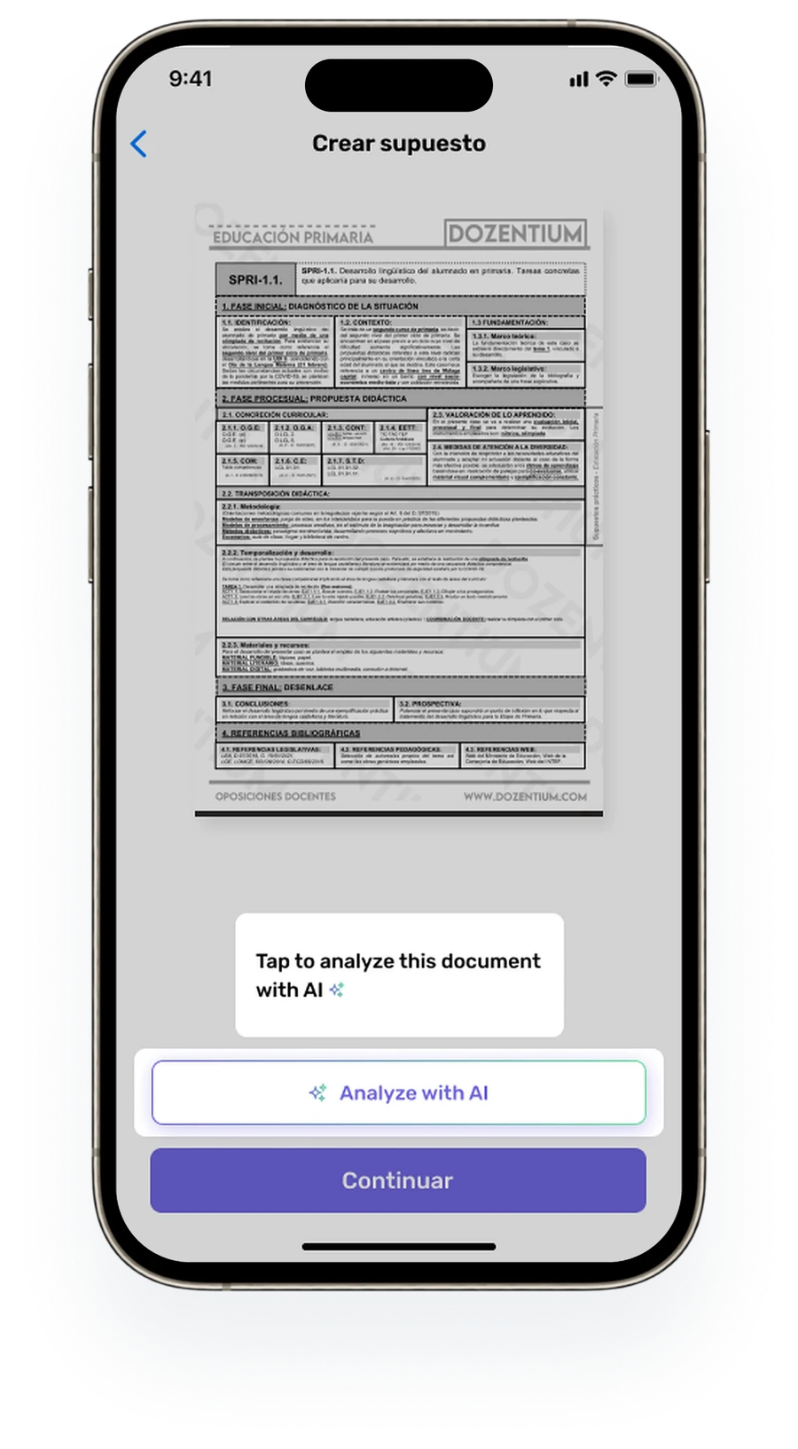
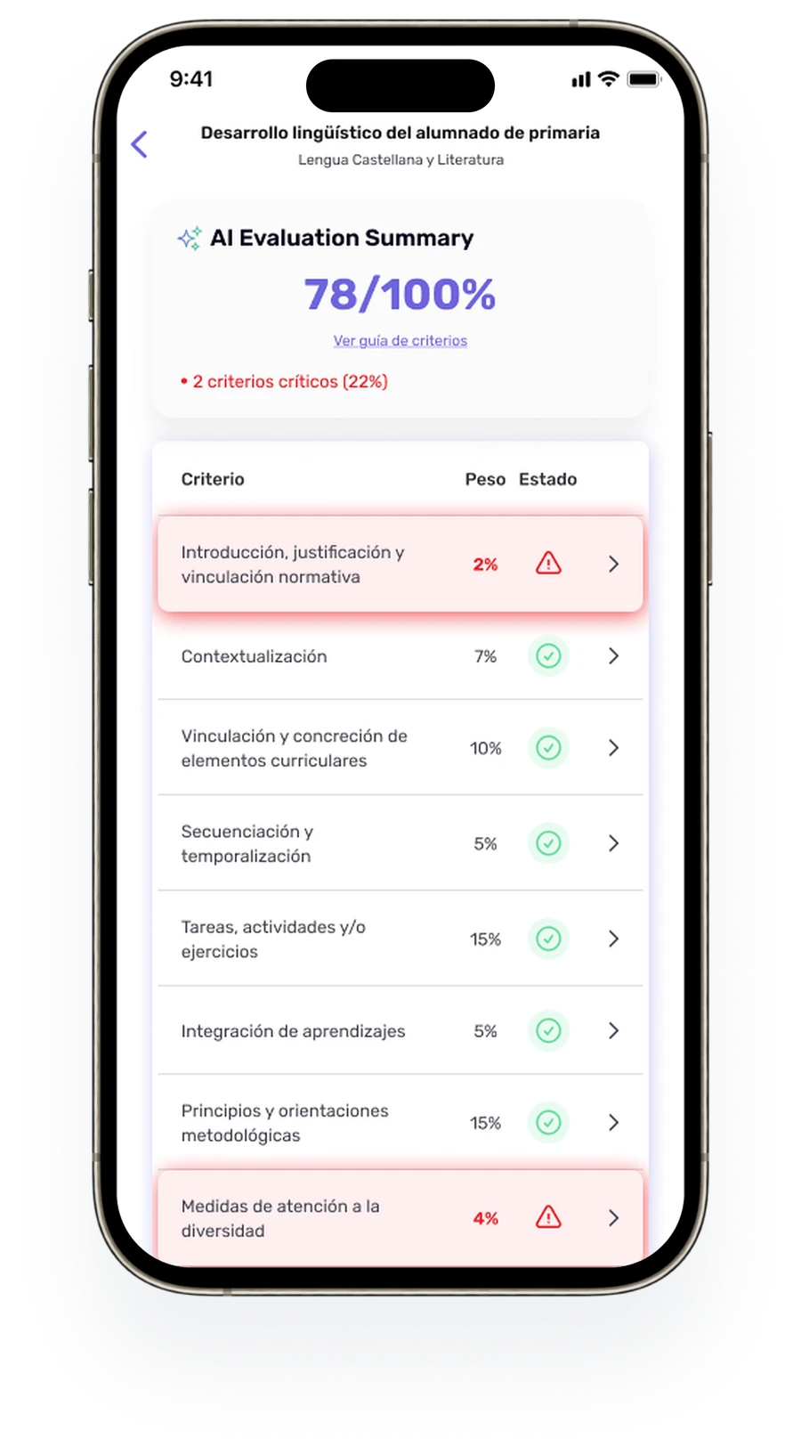
Upload a PDF, see what to fix.
Many opositores already have a written supuesto. Instead of retyping it, they upload the PDF and AI evaluates it criterion by criterion: an overall score, the weight of each criterion and the critical ones highlighted in red, with a direct path to edit them.
Product deep dive
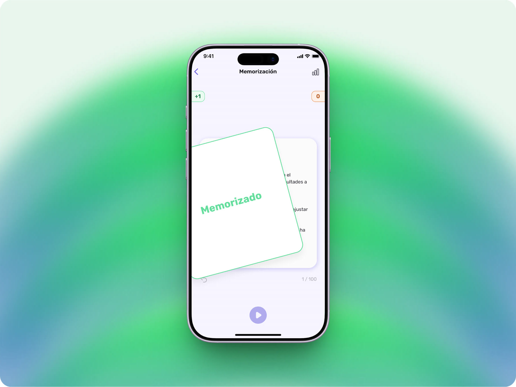
Temario & study loop New module
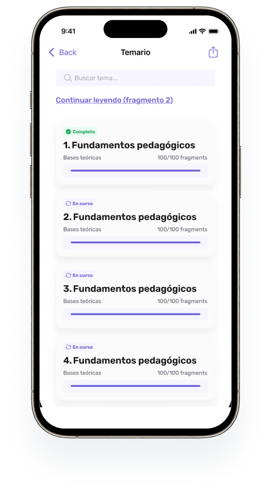
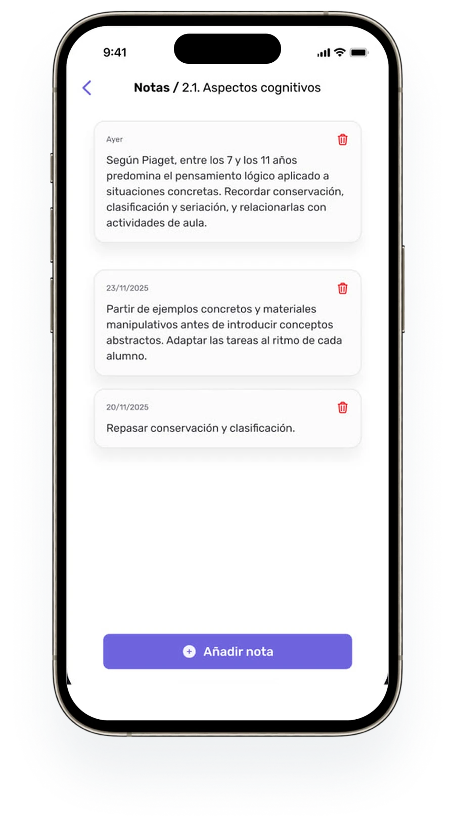
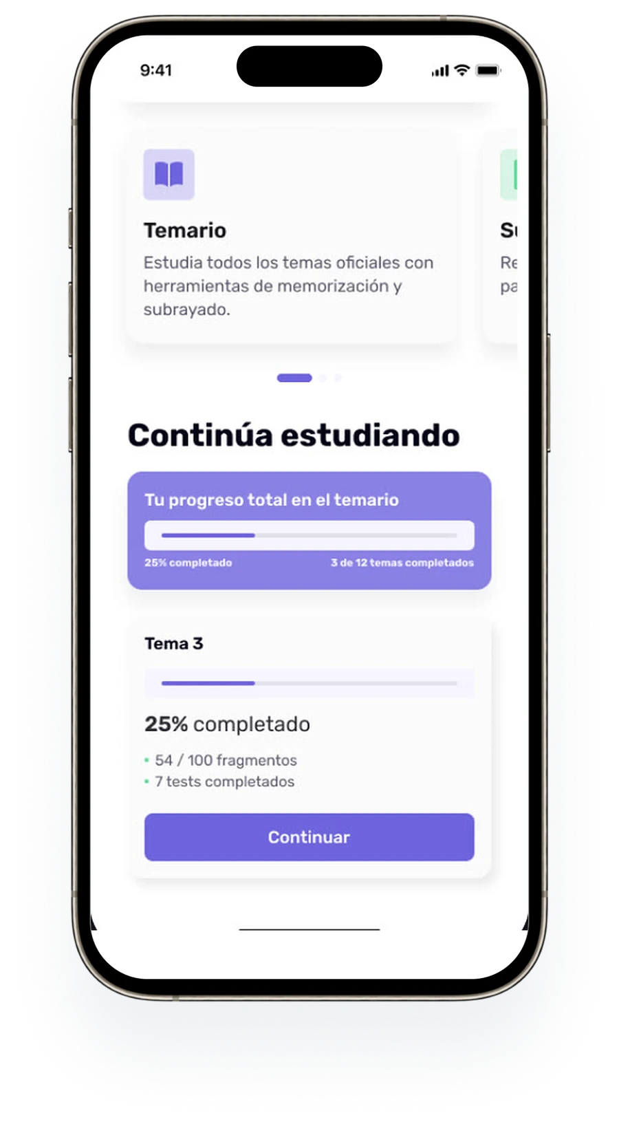
Temario, fragments, statuses, notes and progress: the daily study loop for opositores.
The problem. Topics hold dozens or hundreds of fragments in a fixed order. Opening each one separately would make studying slow, and progress could easily repeat across screens.
Visual language
A visual language built for teaching, not browsing.
Purple signals action, lavender provides calm context, and a small set of status colours shows progress at a glance.
Typography
One family across the whole app: Rubik. Its rounded, friendly shapes keep dense syllabus text legible at small sizes, and a short scale keeps hierarchy predictable: H1 30 Bold, H2 24 Medium, Body 16 SemiBold / 14 Regular, Caption 12 and 10.
Outcomes
69 screens. 8 user flows. Shipped to the App Store.
Complex educational content (temario, practice cases, worksheets and memorisation tools) structured into clear mobile journeys.
My contribution focused on selected user flows, UI improvements, feature design and design system work within the existing product — including an audit and redesign of the Fichas (worksheets) flow and its tablet adaptation.
Have a complex product
that feels hard to use?
This case shows the kind of work I do best: turning dense, structured content into mobile experiences people can actually use.