← Back to work
UX/UI Case Study · Mobile App

PodReads

Letting people read their favourite podcasts, not just listen to them.

A podcast app with transcripts built in, so you can switch between listening and reading — designed from zero based on real user research.

iOS · Android UX Research 0→1 Product 50+ Screens
Role
UX/UI Designer
Type
Personal Project
Deliverables
Research · IA · UI · Prototype
Tools
Figma · FigJam
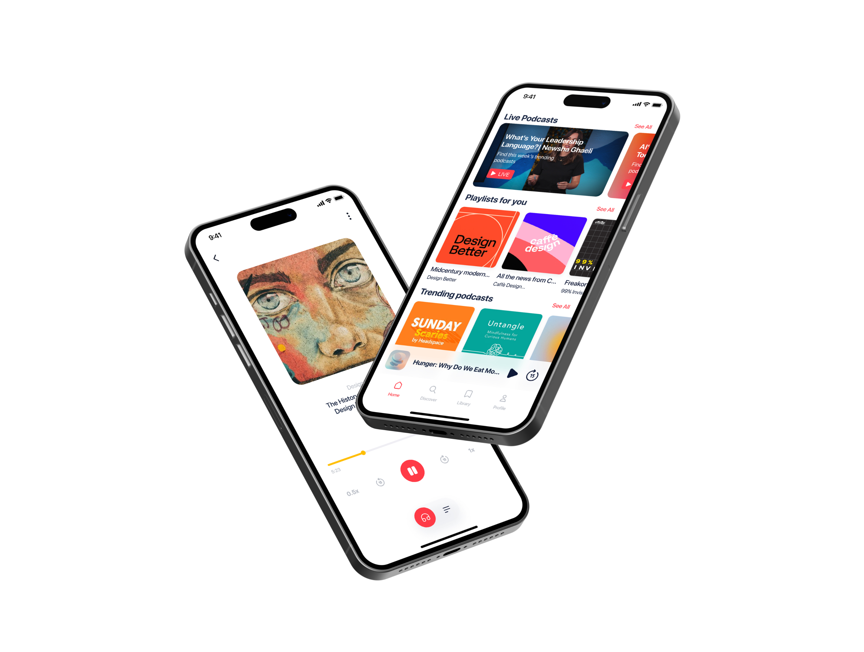
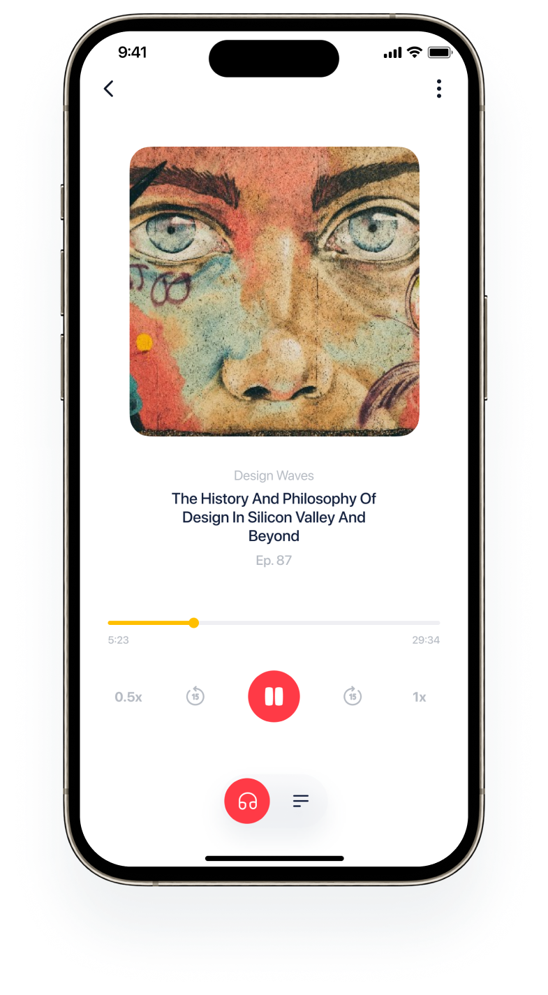
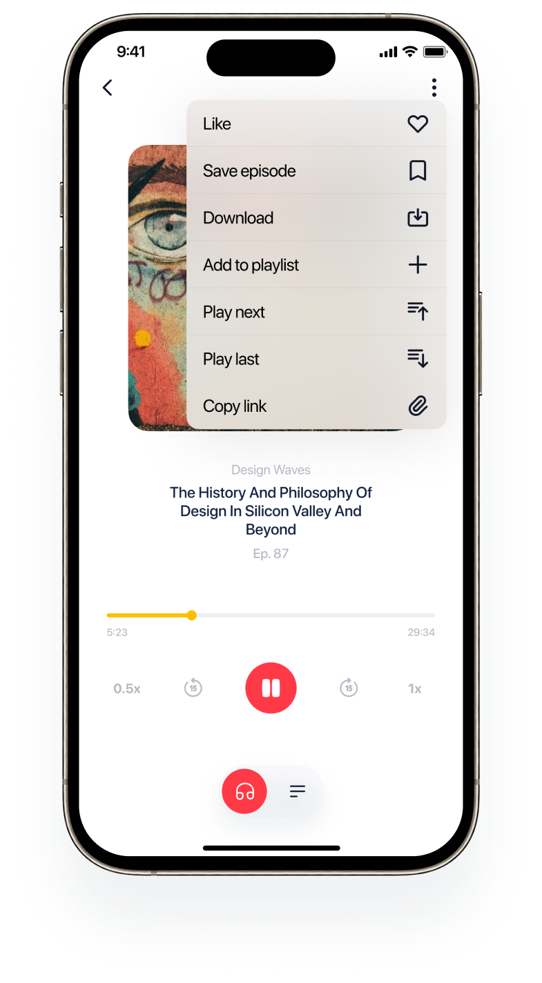
PodReads player with the episode menu open
01 — The Idea

Bringing podcasts
together with reading

PodReads is an innovative app that changes how users interact with podcasts. Unlike competitors, it lets you both listen to and read your favorite shows — enhancing the experience for different contexts and needs.

Whether you prefer listening on the go or reading, PodReads offers a flexible way to enjoy podcasts like never before.

Project overview
0 Survey participants
0 Problem statements identified
0 Screens designed
02 — Design Process

A human-centred
design thinking
framework

I used the design thinking framework, emphasizing research and empathy before touching the UI — making sure the product would be not only functional but aligned with real user needs.

Empathize

Survey

8 participants. Gathered insights into user habits, preferences, and pain points around podcast listening.

Define

Problem Statement + Goal

Synthesised survey data into 6 core problem statements representing distinct user types and needs.

Ideate

User Flow + Information Architecture

Mapped every path through the app, from discovery to segment saving — covering edge cases and decision branches.

Prototype

Lo-Fi → Hi-Fi Wireframes

Started with hand sketches to explore variations before moving to detailed Figma screens.

03 — UX Research

Survey:
8 participants,
real answers

I aimed to gather insights into user habits, preferences, and pain points related to podcast listening — asking what people actually use today and what they're missing.

Quantitative data

What is your main goal when listening to podcasts?

0%
Listen to something new
Most participants listen to discover something new and expand their knowledge.
0%
Learn interesting information
A significant portion values educational content and seeks to acquire new insights.
0%
Self-development & motivation
A smaller share listens for personal growth, rising skills, and guidance.

Quantitative data

Can you envision a life without podcasts?

0%
Yes
Some find podcasts valuable — listening to experts and learning from their experiences.
0%
No
Others believe similar content is available through YouTube or audiobooks.
0%
Other
Podcasts are often consumed in the background; some don't need visuals at all.
What the survey told me

Podcasts are often background listening — so the app shouldn't demand attention, but should make it easy to catch up on what you missed.

04 — Strategy

The goal statement

A podcast app will allow users to discover and listen to podcasts tailored to their specific interests, which will positively affect them by enhancing their knowledge, personal growth, and entertainment experience.

The goal is to create a user-centred podcast app that caters to diverse user needs. Through personalised features and efficient content organisation, we aim to enhance user satisfaction. Success will be measured by positive user feedback reflecting their satisfaction with the app's content and features.

05 — Structure

Information
Architecture

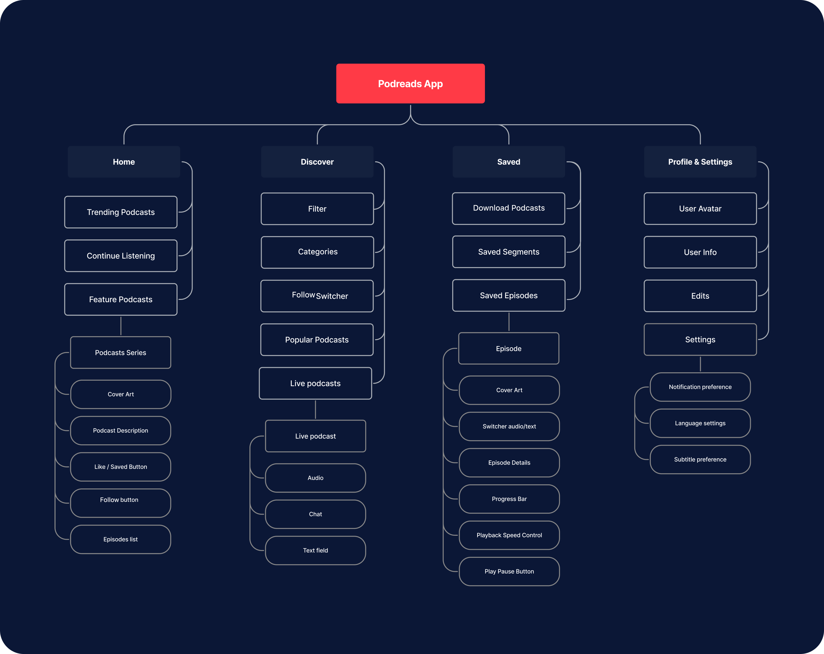
Using all available data, I crafted an IA to organise information effectively. By understanding user behaviours and needs, this IA guides the design toward a user-friendly app that enhances the podcast listening experience.

Information Architecture diagram
User Flow

Mapping every path

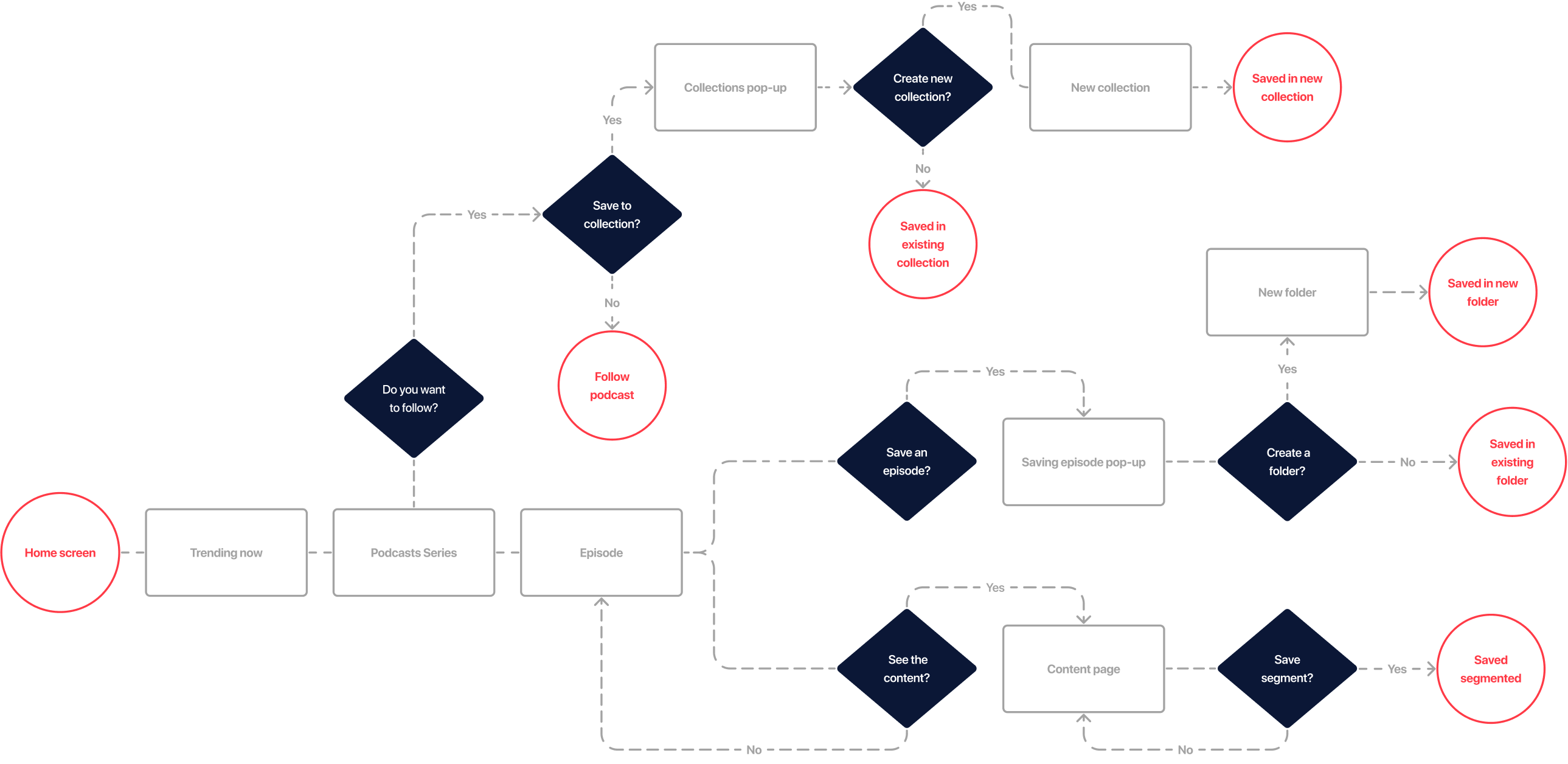
Based on the gathered data, I created a user flow illustrating every step within the app — ensuring a smooth and intuitive journey by analysing user behaviours and covering decision branches.

User flow diagram
06 — Wireframes

Lo-Fi
Wireframes

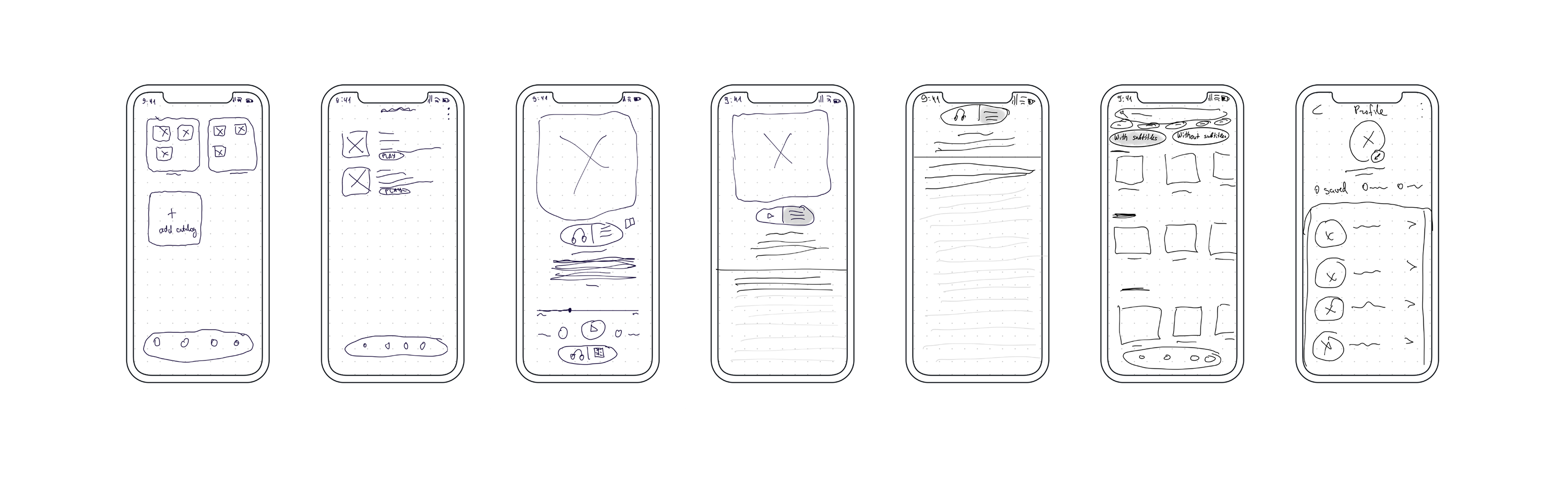
I realised the first ideas that come to mind aren't always the best. Whiteboarding and hand sketches became the first step — helping me explore variations before committing to any direction in Figma.

User listening
Hi-Fi

From sketch
to screen

Once the sketches settled the structure, I turned them into Hi-Fi wireframes in Figma — detailed versions of every screen.

1 Content Organization

Busy users need
to find content fast.

Alex is a busy marketing specialist who needs a podcast app that offers efficient content organisation because of limited time.

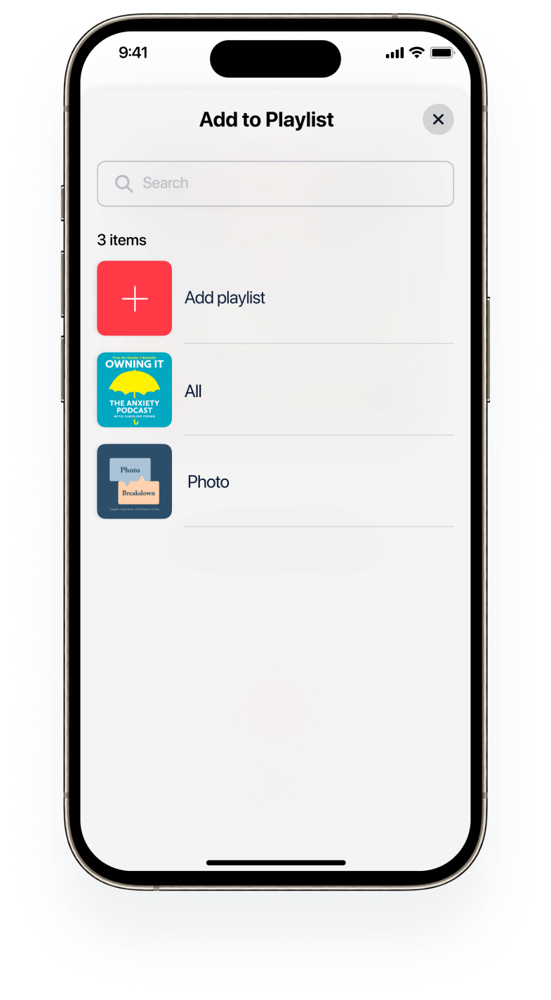
Solution: Intuitive episode management — add episodes to playlists directly from the player view. Users can create collections or choose existing ones on the spot.

The episode menu puts Add to playlist one tap away from the player.

Problem solved for Alex →
Library screen
Library screen

Pick an existing playlist or create a new one without leaving the episode.

Problem solved for Alex ←

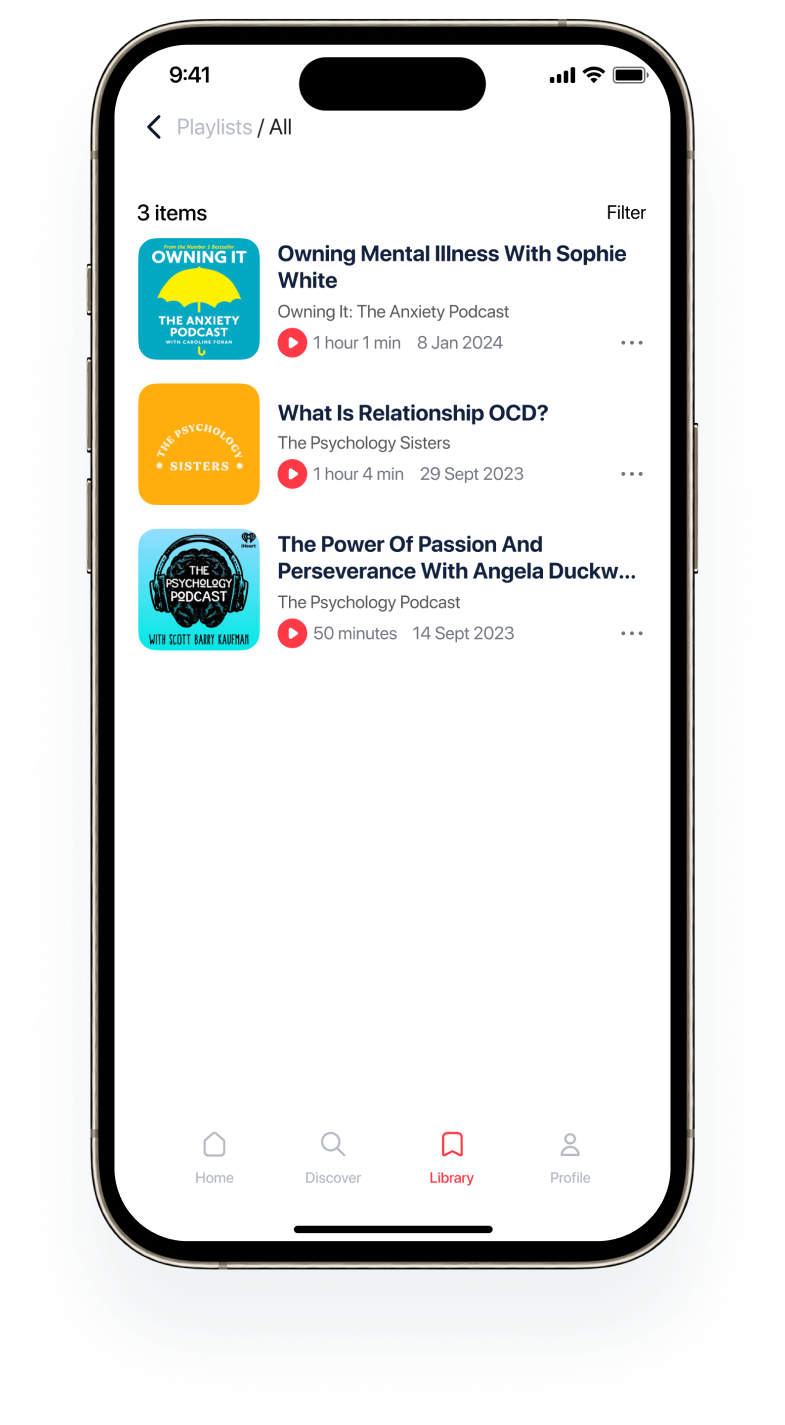
Library: Playlists, Notes, Saved and Download keep everything a listener collects in one place.

2 Language Barrier

Understanding spoken
content across languages.

Emily is a student who needs a podcast app with subtitles because the language barrier sometimes makes it difficult to understand spoken content.

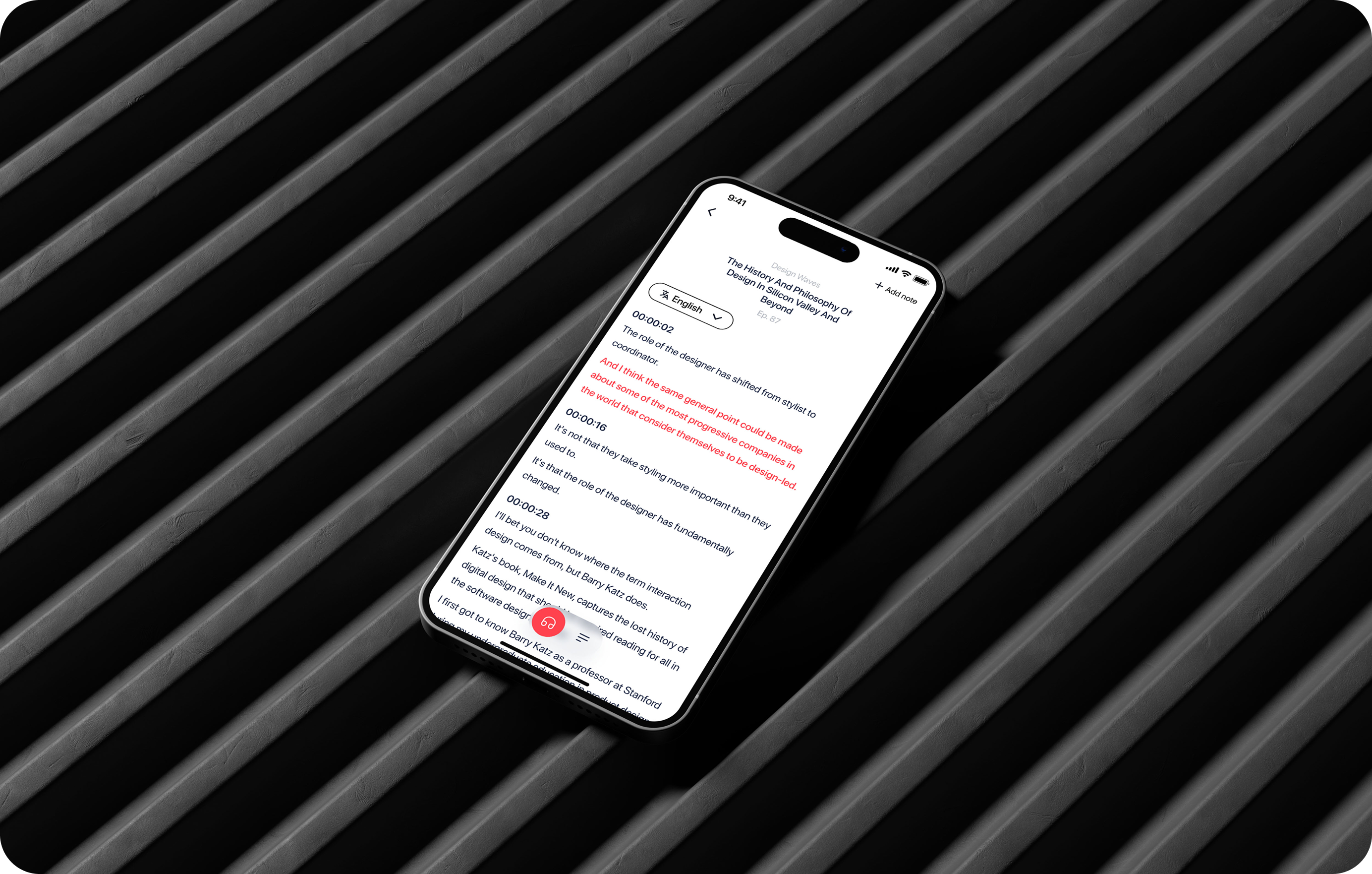
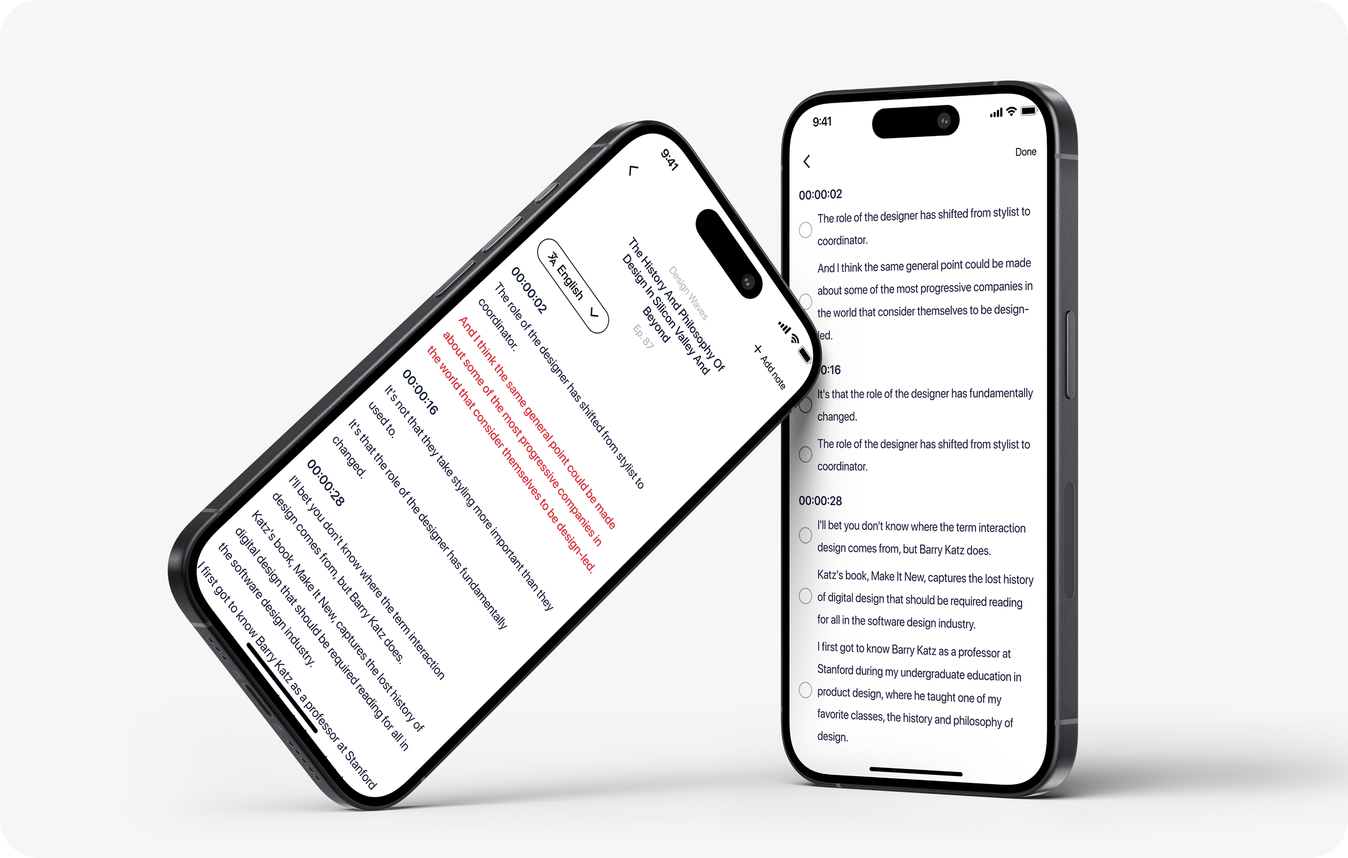
Solution: A convenient toggle switch lets users enable or disable subtitles. A word-highlighting feature visually links spoken words to their written counterparts in real time.
Library screen

One toggle switches the player between listening and reading.

Problem solved for Emily ←

The transcript shows timestamps and a language picker, and highlights the words being spoken.

Problem solved for Emily ↓
Language barrier solution screens
3 Manage Subscription

Following content
that actually matters.

Sarah is a self-development person who needs a podcast app that makes it easy to manage subscriptions because it helps her find content faster.

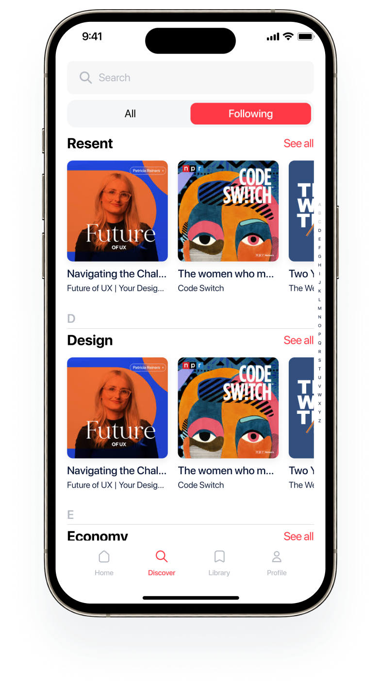
Solution: A switcher between "All Podcasts" and "Following" lets users segment content by preference. The "Following" section organises topics alphabetically for effortless navigation.

The All / Following switch separates discovery from shows you already follow.

Following is sorted alphabetically, with an A–Z index for quick jumps.

Problem solved for Sarah →
Library screen
4 Effortless Segment Saving

Save the moments
that matter most.

Ed is a writer who needs a podcast app with easy-to-save segments because he wants to capture important information he often misses while listening.

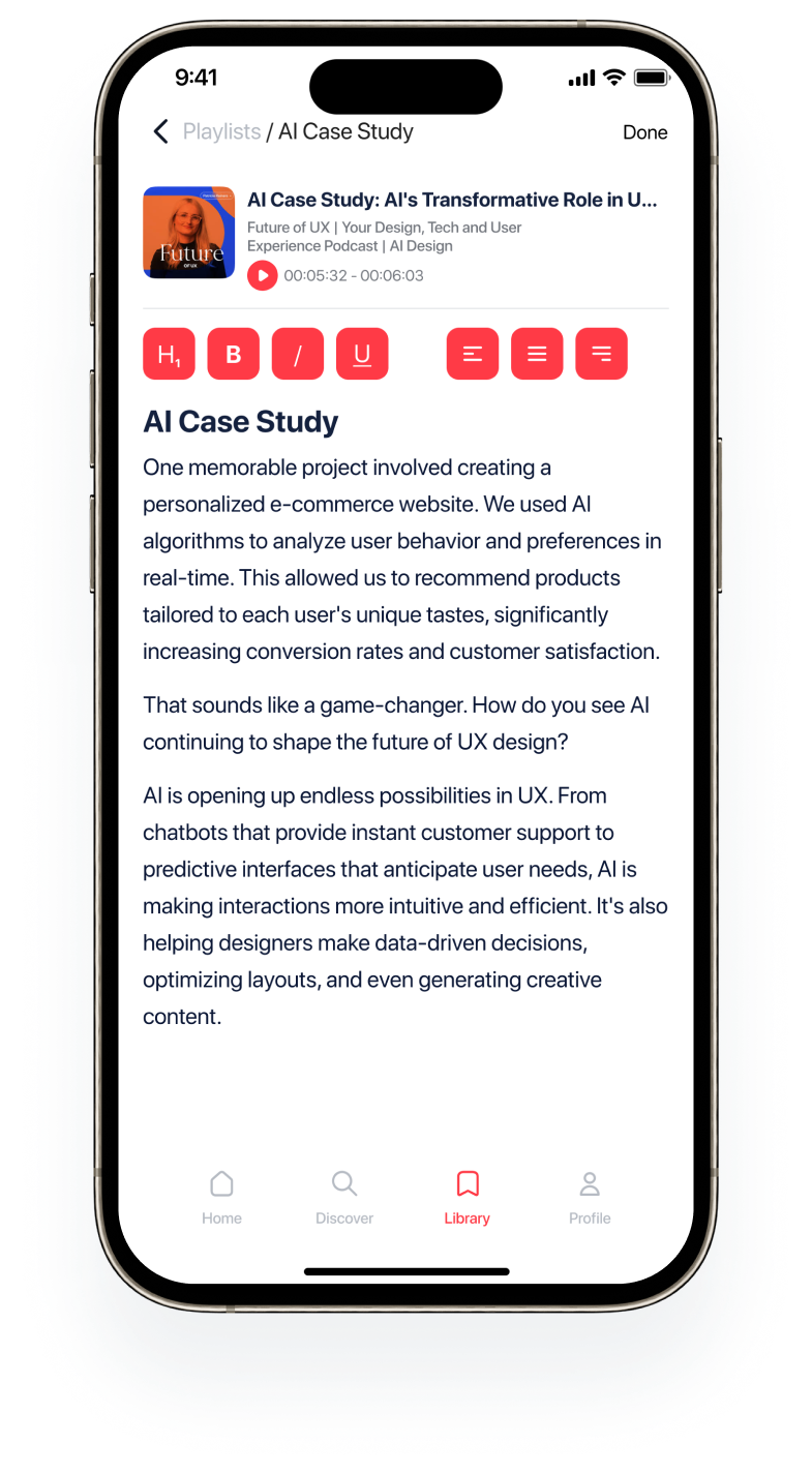
Solution: Users can save specific segments, add written notes with custom font styling, and filter saved content for easy retrieval — without ever pausing the podcast.
Library screen

Saved episodes live in playlists, with a filter for quick retrieval.

Problem solved for Ed ←
Segment saving screens

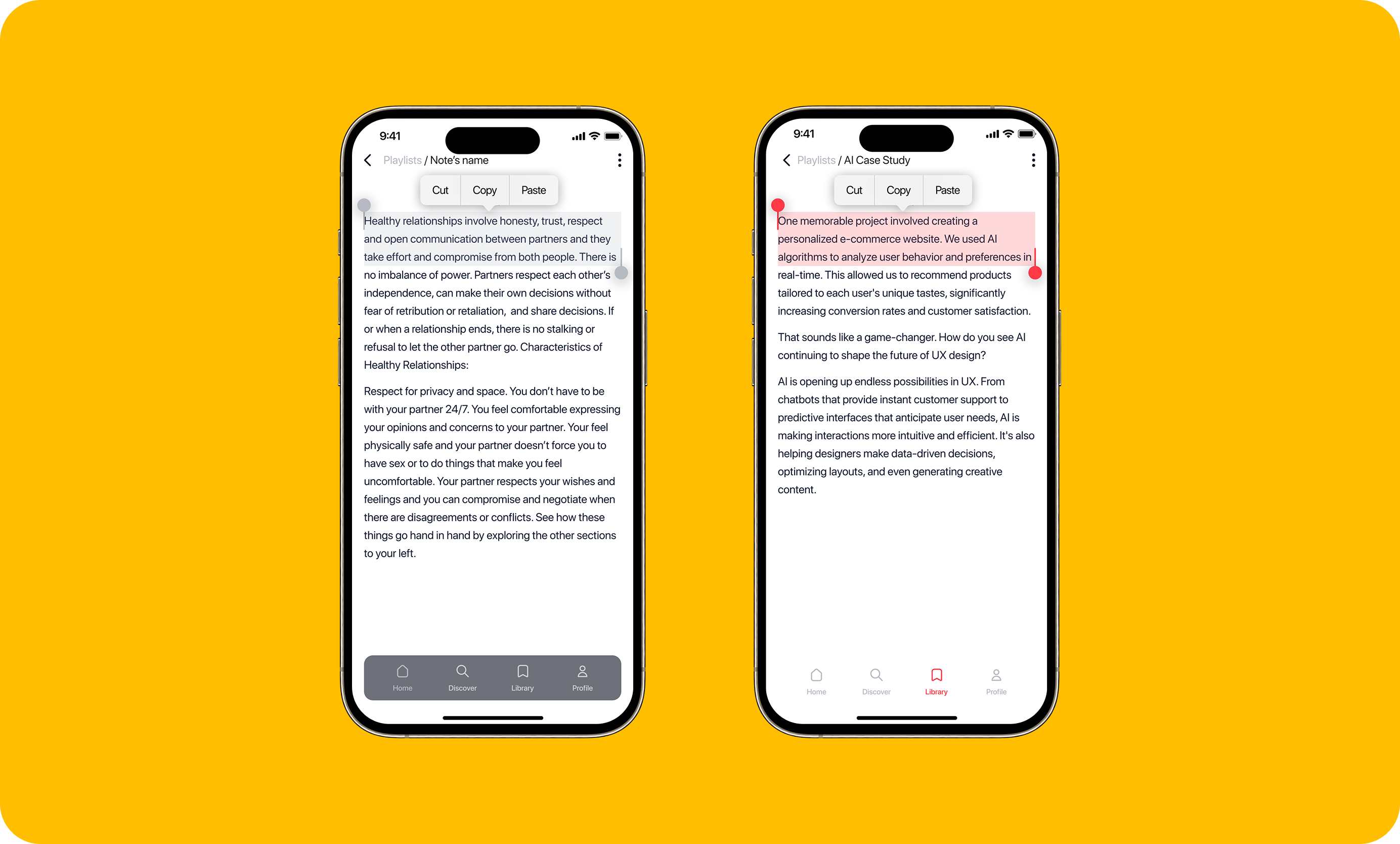
Copied passages become notes that keep the segment’s timestamp, with simple text formatting.

Problem solved for Ed →
Library screen
Segment saving screens
5 Personalized Recommendations

Content tailored
to your interests.

Michael is a back-end developer who needs a podcast app with personalised recommendations because of a lack of content diversity in existing apps.

Solution: "Trending Podcasts" and "Top Podcasts" sections personalised by user preferences. A dedicated section for live and real-time broadcasts.

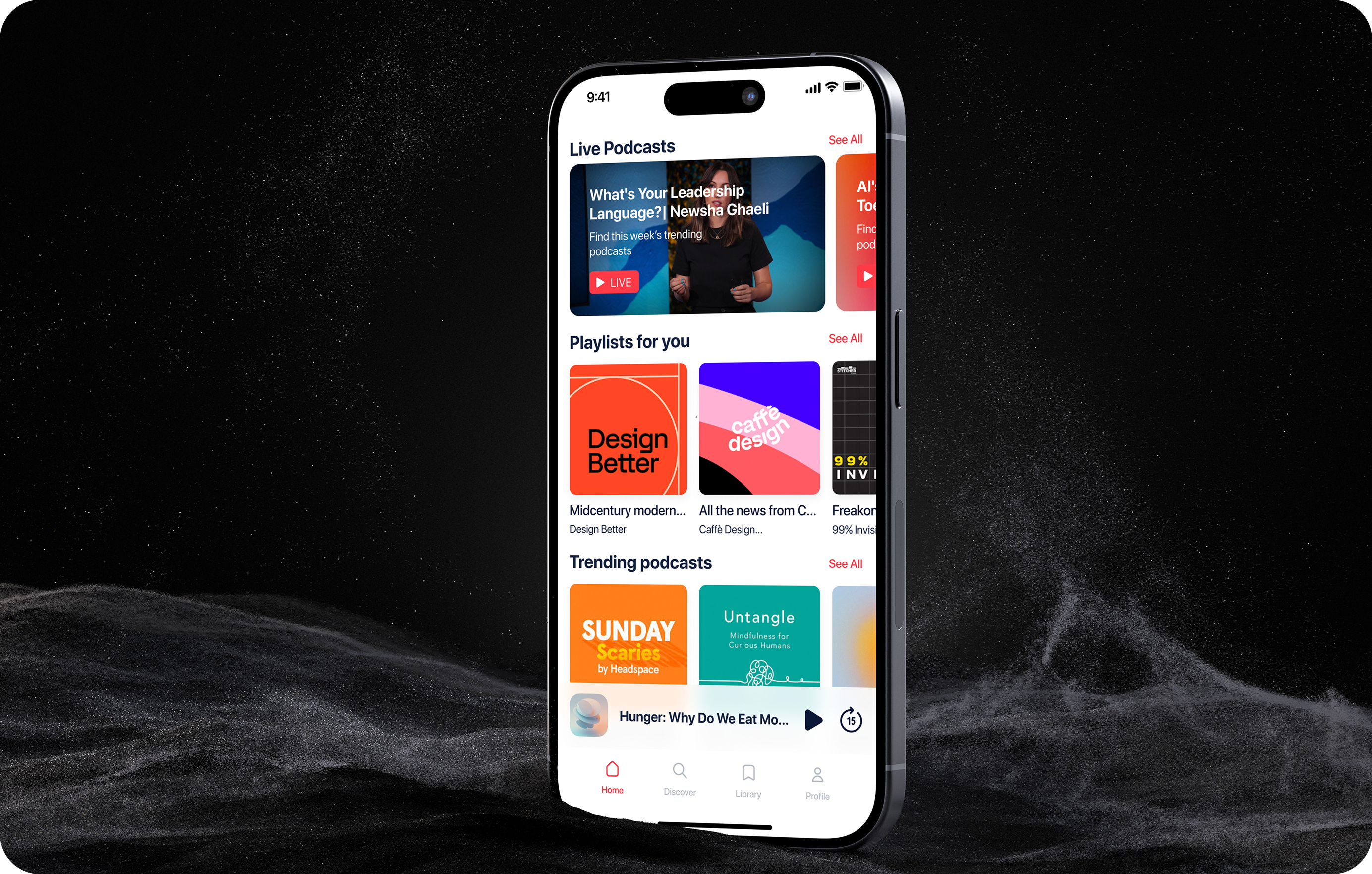
Home opens with Live podcasts, then Playlists for you and Trending podcasts.

Problem solved for Michael ↓
Personalized recommendations
6 Real-Time Interaction

Engage live with
hosts and listeners.

Maria is a podcast enthusiast who needs real-time interaction during live podcast sessions because she wants to engage with hosts as the podcast unfolds.

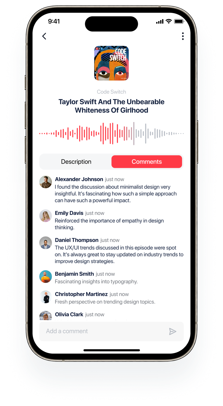
Solution: A live chat feature lets users ask questions, share opinions, and interact in real time. Users can also join before a live session to set reminders and prepare questions.
Library screen

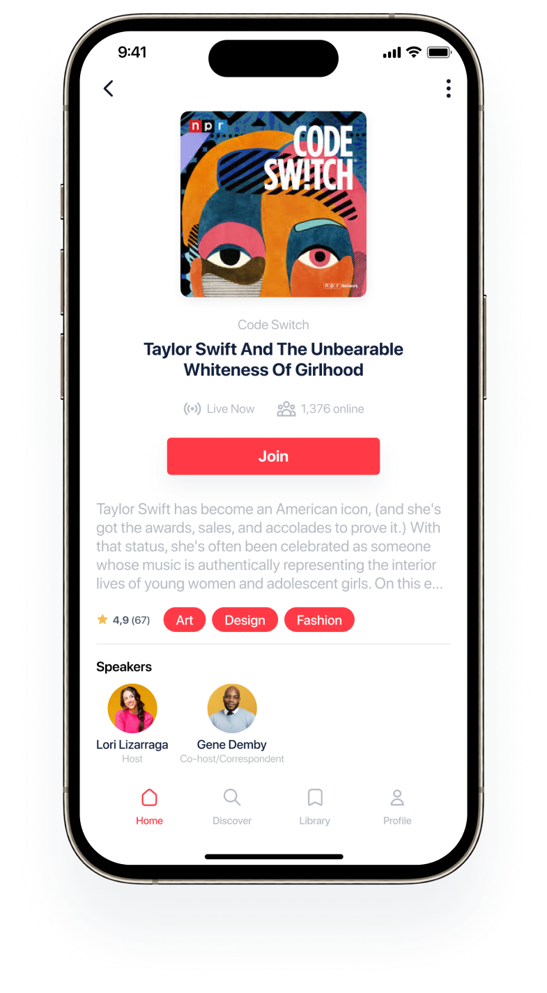
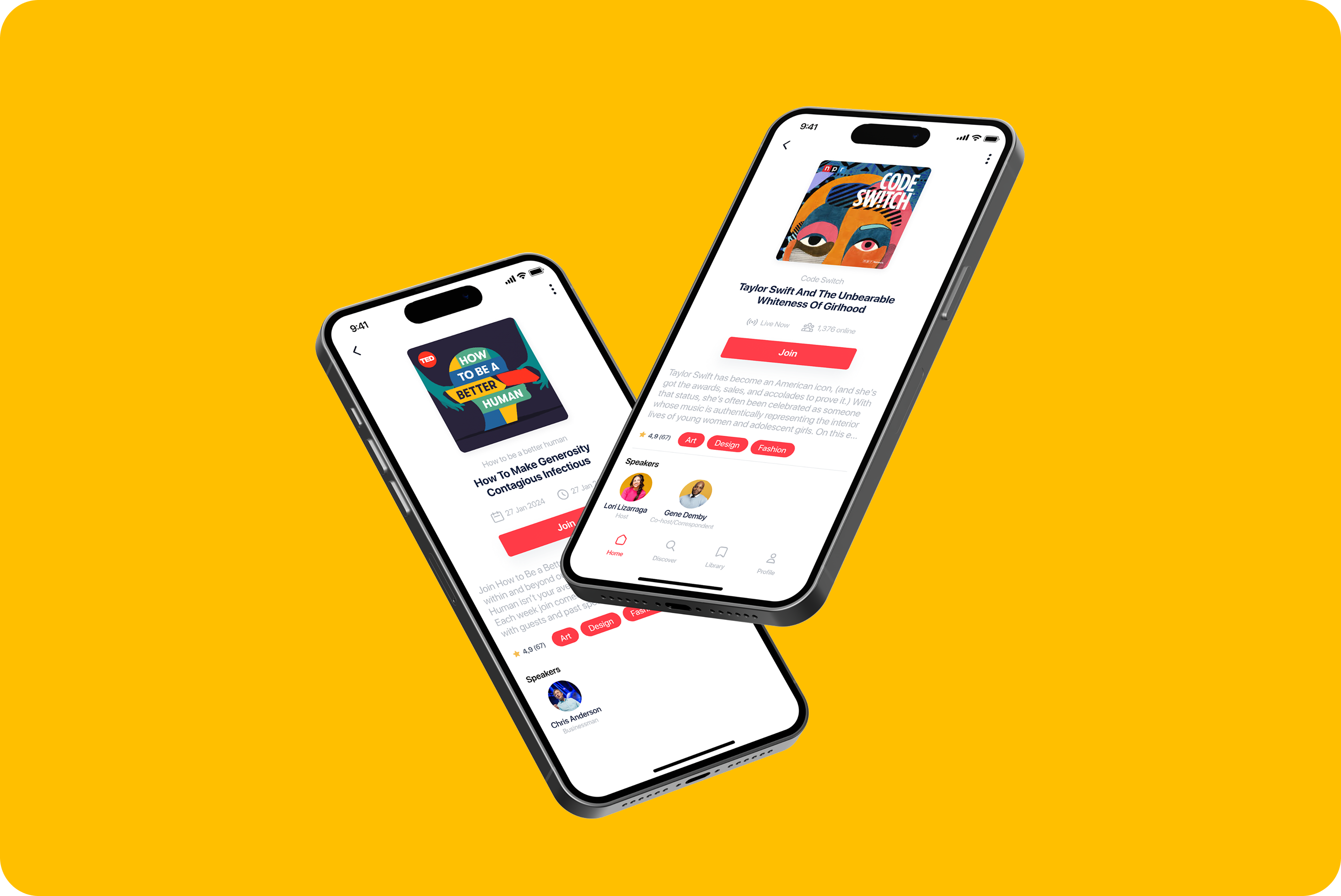
Before a live session: event details, speakers and a Join button.

Problem solved for Maria ←
Live episode pages with speakers and a Join button

During the session, the Comments tab becomes a live chat with hosts and listeners.

Problem solved for Maria →
Library screen
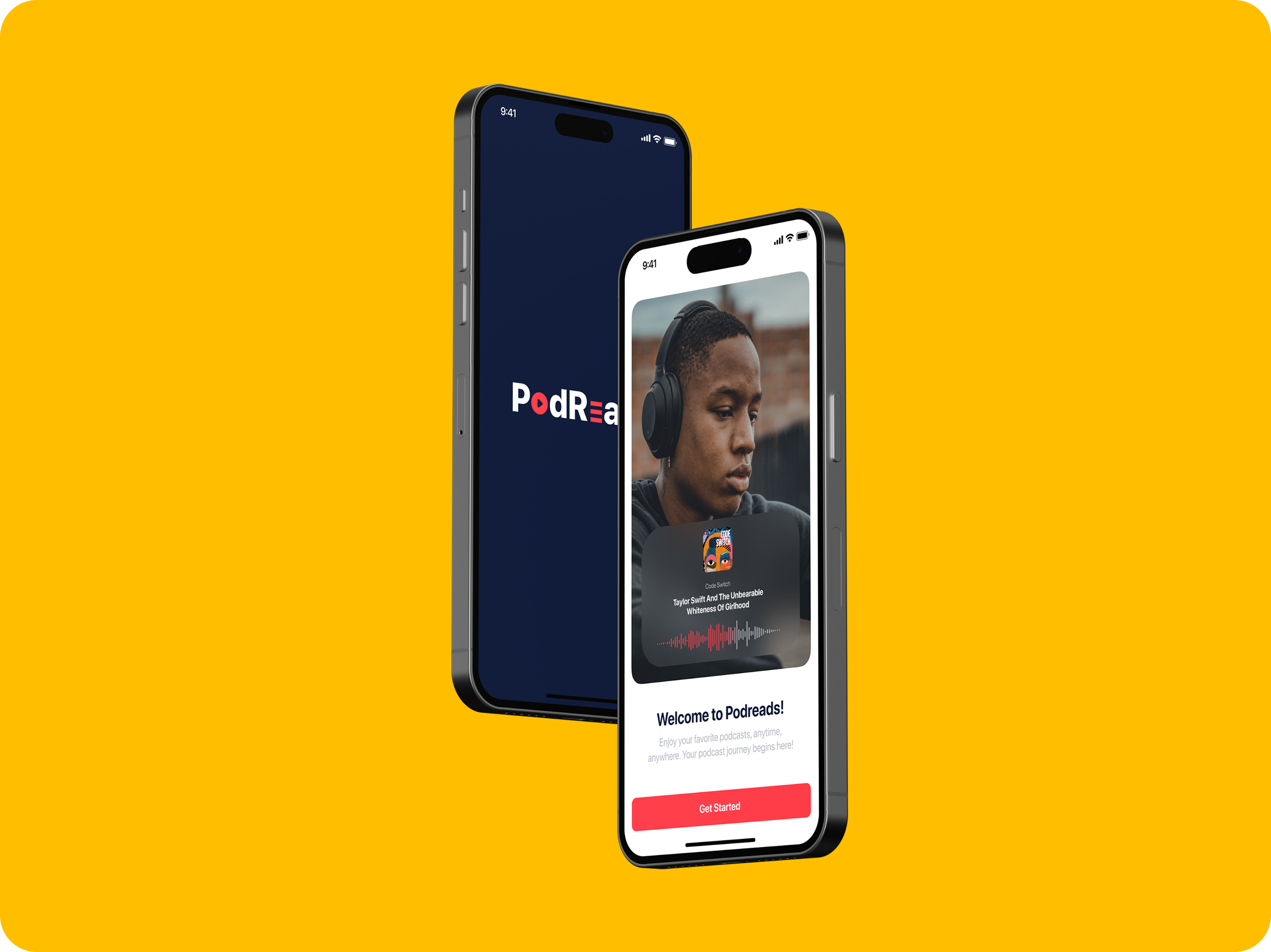
PodReads splash screen and welcome screen

Splash and welcome screens: the brand palette in use, with one clear action, Get Started.

07 — Visual Design

Visual
identity

Based on gathered data, I created the visual identity for the app — deciding on colours, fonts, and images that give PodReads its unique look and feel. Bold red energy, dark navy depth, yellow warmth.

#FF3A46
#0B1736
#14213E
#FFBF00
#B6BBC3

Typeface: SF Pro Display · Regular, Medium, Bold

Like what
you see?

I'm available for senior Product Designer roles and select freelance work. Let's build something together.

← LEGO Block Next: EduOpos →